How is the importance of viewing the Mobile version of your WordPress site?
According to many surveys, more than 50% of your website visitors tend to use their mobile to access your website instead of using their computer. It is also a reason why you should make sure that your website looks great when display on all devices.
Although nowadays, most WordPress WordPress Themes that you are using is fully responsive, you should still check how it appears on mobiles first. In addition, it is necessary for you to generate various versions of your main landing pages that will be optimized for mobile users’ demands.
Moreover, the mobile phone is one of the most crucial factors that Google is using as a priority index for their website ranking algorithm.
How to preview your mobile layout?
In today’s tutorial, we share with you the two ways to help you easily view the mobile version of your WordPress site. However, not thing is perfect because there are so many mobile screen sizes and browsers.
Using WordPress Theme Customizer
First of all, this is the simplest way to view the mobile version of your WordPress site by using the WordPress Theme Customizer.
Simply go to Appearance > Customize screen.
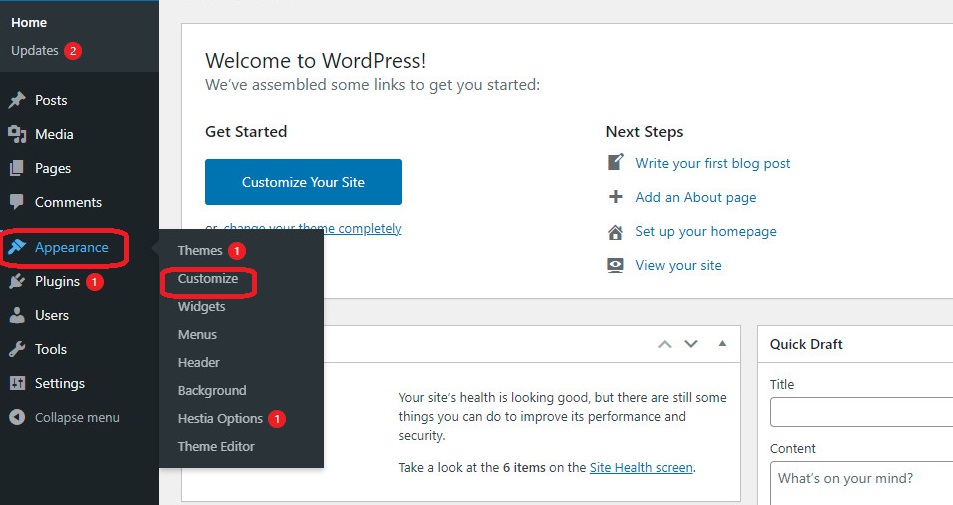
This will open the WordPress theme customizer that you are using. Now, have look at the left-hand screen, you will see a list of tabs depending on the theme that you are utilizing. In addition, you will see a mobile icon displayed at the bottom of the screen.
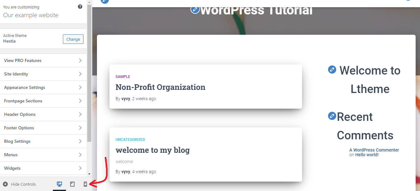
By clicking on it, you will see a preview of how your WordPress website will look on mobile devices.
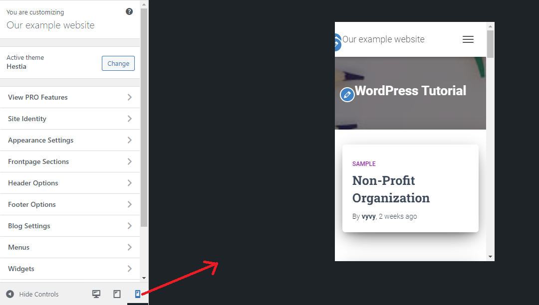
This method is suitable for you to view the mobile version of your WordPress site when your website site is not live yet. Because it is easy for you to make changes to your website by clicking on the editing symbol when your site is under maintenance mode or you have not finished your blog yet.
Using Google Chrome’s Dev Tools
There are a lot of developer tools that are included in Google Chrome. These tools enable you to perform plenty of checks and tests on your website that include previewing the mobile version of your WordPress site from your desktop.
In order to use this method, firstly, you need to open Google Chrome browser on your desktop and visit the page that you want to check. Now, you need to right-click on the page and choose the “Inspect” option at the bottom of the options listing.
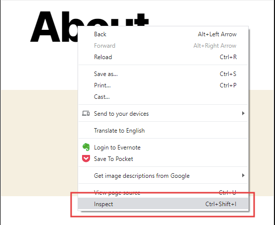
This will open a new panel displayed on the right-hand side of the screen where you are able to see your site’s HTML source code in the developer view.
Now you need to click on the “Toggle Device Toolbar” option to switch to the mobile version.
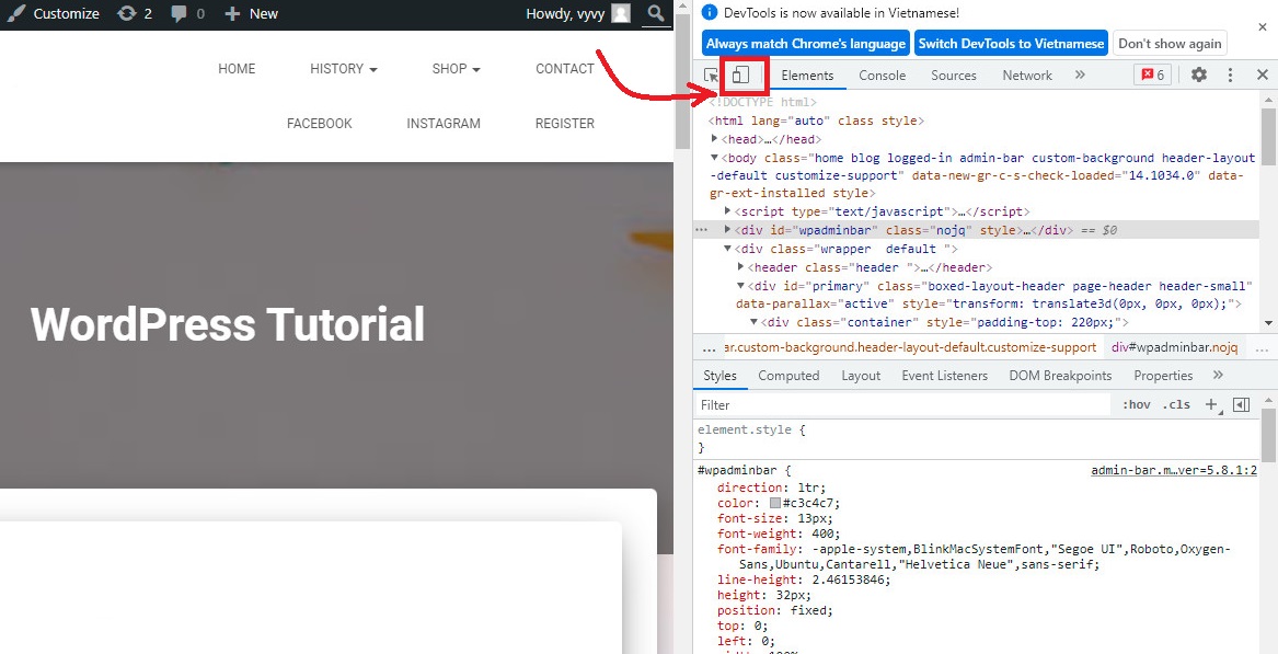
After that, you will notice your website’s look change to the mobile version. For example, the menu of your website has disappeared.
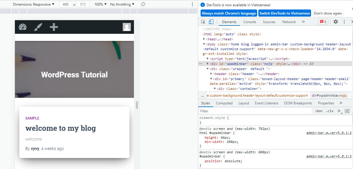
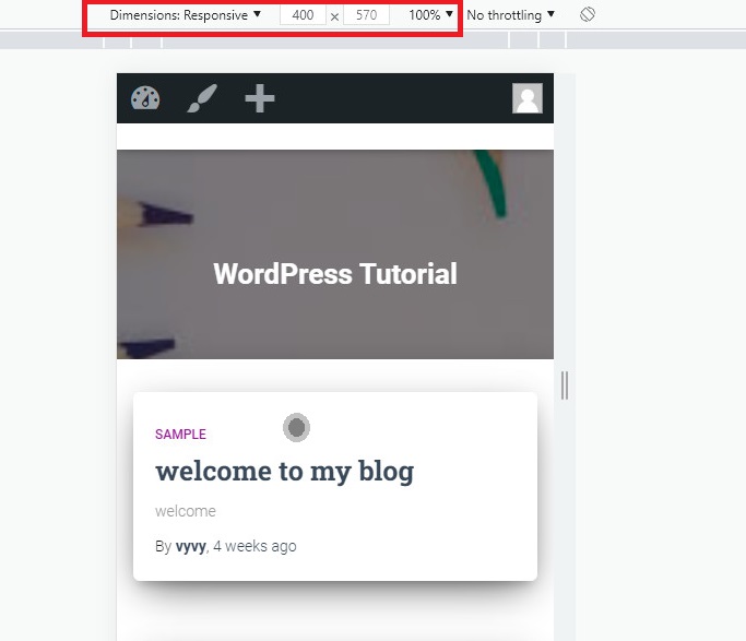
Moreover, you will see some additional options above the mobile view of your site. These options will enable you to perform a lot of extra functions. For example, you can check how your site displays on various smartphones by clicking on the Dimensions option. In addition, it can stimulate your site’s performance on different smartphones with percentage indicators
Summary
In nutshell, it is crucial to make your site responsive when displaying on all devices. We expect that this article helps you learn how to view the mobile version of the WordPress site as well as prevent your website from fault in design. Thanks to that, you will easily build a successful website. If you have any queries, don’t hesitate to mention them by leaving a comment below.
Moreover, you can refer to a ton of beautiful, modern Themes at our Free WordPress Themes. They are 100% responsive to make sure that your website will look great on any device.
The post How to View the Mobile Version of WordPress site from desktop? appeared first on LTHEME.
![[Joomla] How to remove or hide Fields marked with an asterisk (*) are required](https://4.bp.blogspot.com/-O3EpVMWcoKw/WxY6-6I4--I/AAAAAAAAB2s/KzC0FqUQtkMdw7VzT6oOR_8vbZO6EJc-ACK4BGAYYCw/w680/nth.png)
![[Joomla] How to remove or hide Fields marked with an asterisk (*) are required](https://4.bp.blogspot.com/-O3EpVMWcoKw/WxY6-6I4--I/AAAAAAAAB2s/KzC0FqUQtkMdw7VzT6oOR_8vbZO6EJc-ACK4BGAYYCw/w100/nth.png)
0 Commentaires