
As an online business owner, the homepage of your website serves as your virtual storefront, so you’ll want to make sure you’re getting it right. Having a great homepage can help to build trust with potential customers, and it also gives people a great first impression of your company.
So, in this article, we’re going to take you through five different tips that can guide you in designing an effective homepage for your site. Read on to find out more.
Use strong imagery that shows what your business is about
Strong visuals are important for getting people’s attention and letting them know what your business is all about. You could use imagery to put a face to your business, show people what it’s like to work with you, and also show off your brand’s personality.
To give you some inspiration, let’s take a look at some examples of sites that use images well on their homepages.
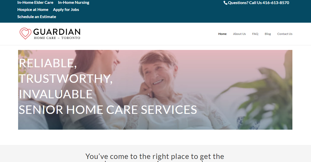
On Guardian Home Care’s homepage, you’ll see that they use several images of people who look like compassionate caregivers taking care of elderly people. As a company that provides senior home care services, they want prospective clients to know that patients will be well taken care of and these images on their homepage do a great job of showing that.
Even without reading a single word, these strong images already tell website visitors what this business is about — it’s a company that truly cares about its clients. And that’s the exact impression a business like this will want to give off, so their approach is very successful.

On the other hand, Best Value Schools is an online resource for people who want to find out which are the best schools to go to. Looking at their website, you’ll see that they’ve included images of different students on their homepage. There are images of students who look like they are in classrooms, as well as others who seem to be graduating.
These are great aspirational images, as they will help website visitors to imagine themselves studying, and show them how exciting it will be to complete their chosen courses. If you also want to do something similar for your homepage, choose imagery that will encourage website visitors to imagine what their lives could be like if they were to invest in your products or services. It can be great for motivating them into finding out more and making a purchase with you!
Ensure people can take the next step quickly and easily
When prospective customers land on your homepage, you need to make it as easy as possible for them to take the next step, as this will increase your chances of making a sale.
To help people find more information or move forward in the buying journey, you could try to provide a sophisticated search feature or make sure you’re using clear calls-to-action (CTAs).
You could also make it easier for them to take the next step by providing multiple contact options like an email address, phone number, or contact form so they can get in touch with your business in a way that they’re comfortable with.
Now let’s study how some sites are doing this well.
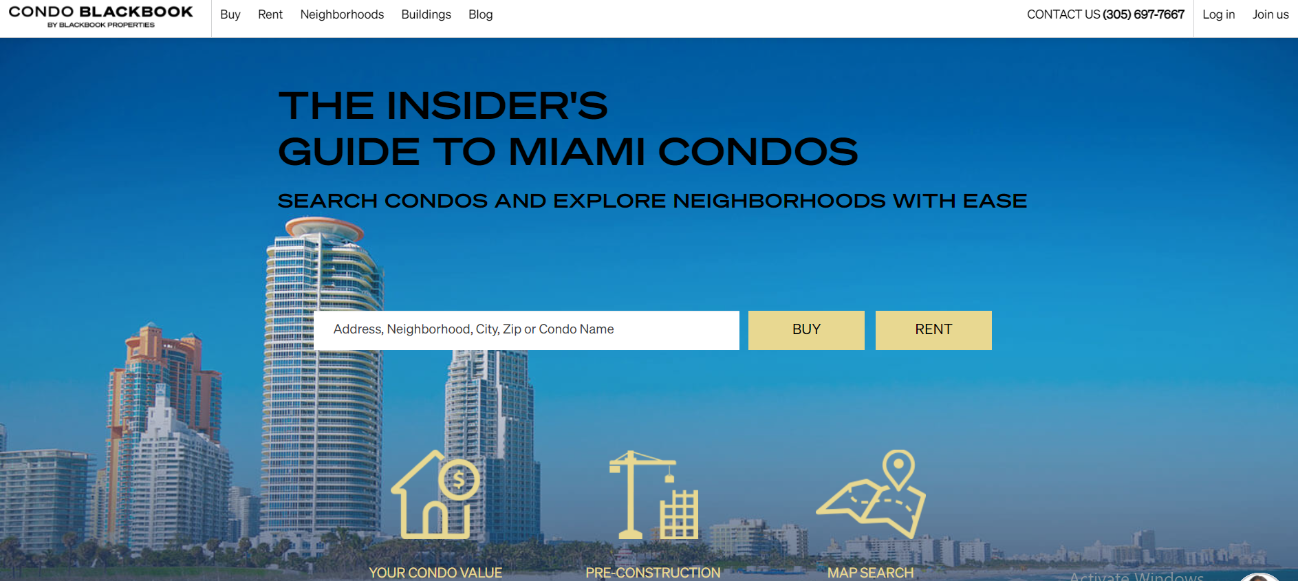
For instance, take a look at the website of CondoBlackBook, a real estate business. On their site, you’ll find that they’ve done a great job of simplifying the often stressful process of buying or renting a condo. They’ve done this with a sophisticated search tool that allows people to search for condos by using an address, neighborhood, city, or even the zip code of the area where they would like to buy or rent. It’s a very useful and powerful tool that gives their customers so much information about the available condos, and it highlights specific details like the number of rooms, bathrooms, building amenities, and estimated costs of the property someone might be interested in.
And, if that isn’t enough, they also make sure to provide various contact options, such as a contact number, an email address, and a live chat option for those who want to get quick answers from a company representative.
As you can see, these are very effective techniques that can greatly improve the user experience of your homepage, so it’s worth considering whether you can replicate these features on your own site.
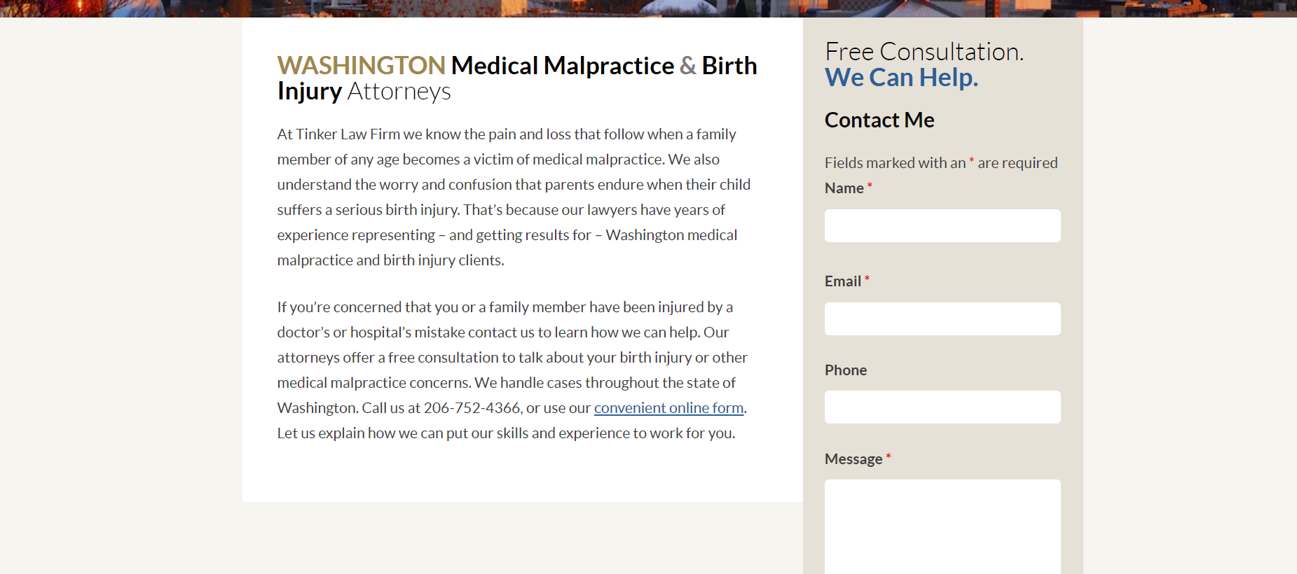
The Tinker Law Firm also ensures it’s very easy to take the next step from their homepage, and they do this by providing multiple contact options for their website visitors. On their homepage, you’ll immediately see a contact number at the top of the page that prospects can contact if they want to get a free consultation.
And, if you scroll further down, you’ll also find a contact form where people can fill in their details and include a message or question. Sending a message through this form can help potential clients to get more information about the free consultation offered by the company and it also allows them to find out what the next steps are if they want to use the company’s services.
Depending on the kind of service-based business you own, it can also be beneficial for you to include multiple contact options like a phone number, contact form, or even a live chat feature so people can get in touch with your customer service team about what to do next.
Create a space for positive social proof
Displaying social proof is one of the most effective ways to show future clients that you’re great at what you do. If you’re able to show them reviews or testimonials, they’ll know that you’ve been able to get excellent results for other clients and this can convince them to work with you.
You could also display media mentions and relevant qualifications to let people know that you are recognized as an authority in your industry and are capable of getting the job done. To show you how it’s done, let’s look at how Bizango chooses to show social proof on their homepage.
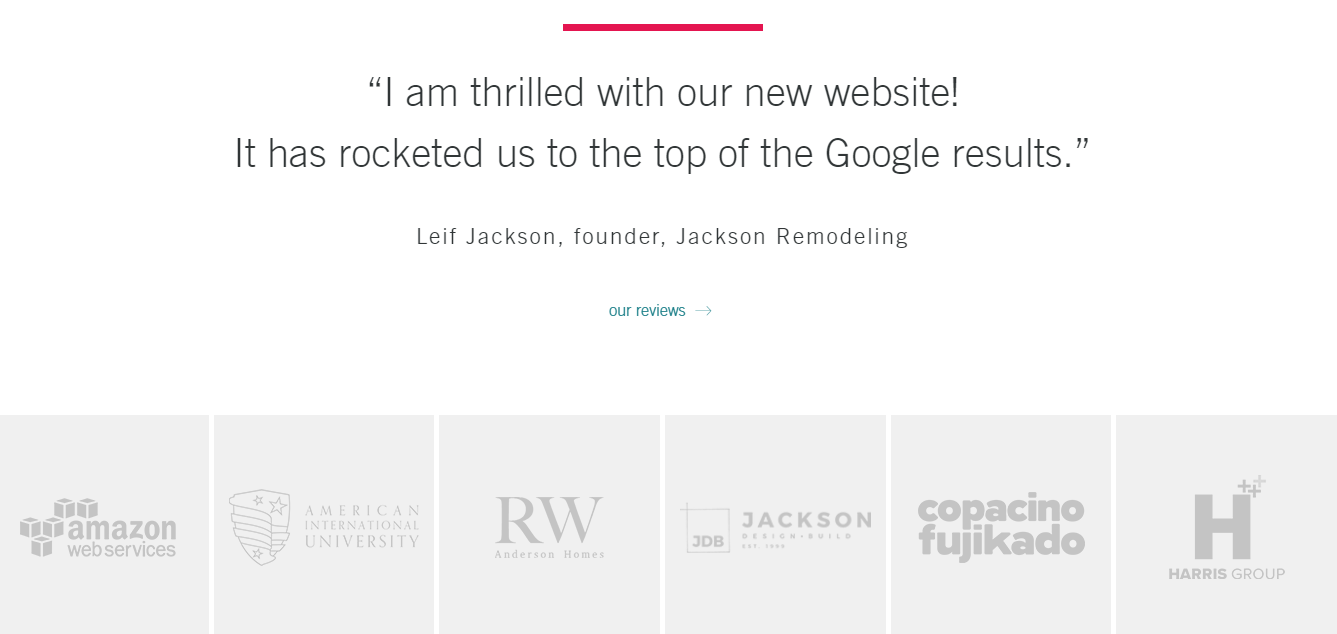
As a digital design and marketing agency, Bizango will have some prospective clients who want to know whether or not they can trust the company to deliver excellent work.
And what better way to show them proof of this than with the words of past clients who have enjoyed fantastic results? The company does a great job of highlighting a positive review from a customer on their homepage and they even include a link to a whole other page filled with similar testimonials. If you aren’t already showing reviews from past customers on your website, then you should take this as a sign for you to start.
If you’re having trouble figuring out how to get these reviews, you can simply send past clients an email or a survey form asking them what they think of your business and how likely they are to recommend your services to others. And, to display these reviews, you can choose from various testimonial plugin options that offer different beautiful display styles or templates.
Make sure you create an intuitive navigation
When creating your website, you should try to make it incredibly easy for visitors to find exactly what they need from your homepage. If you don’t do this, people are likely to leave your website without buying anything.
One of the ways you can do this is by creating intuitive navigation for your website. For example, you could allow people to navigate your site by the type of person they are (for instance, a student or teacher if it’s a school website). Alternatively, you could help them browse depending on the type of products they’re looking for or the problem they’re trying to solve.
Now let’s take a look at some examples of sites with intuitive navigation menus, which also demonstrate some of the different approaches you can take.
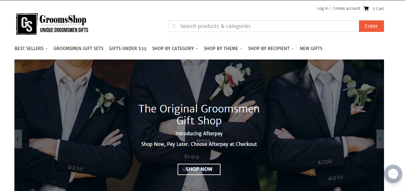
GroomsShop is a company that sells various gifts for groomsmen. And, if you take a look at their website, you’ll see that they’ve employed the use of an intuitive navigation for their site. And they’ve done this in a way that allows visitors to search for gifts in different categories.
This means people are able to search by theme, recipient, or type of product, such as cufflinks, cigars, or decanters. And, with this menu, they’ve made it easier for people to find the exact gifts they need, which can lead to more sales for the business and a reduction in the time prospects spend looking through their website for a particular item.
The quicker you can help your customers find what they’re looking for from your homepage, the more likely they’ll be to spend money with you! So, if you own an ecommerce website, it’s well worth taking a leaf out of GroomsShop’s book and creating a user-friendly menu.
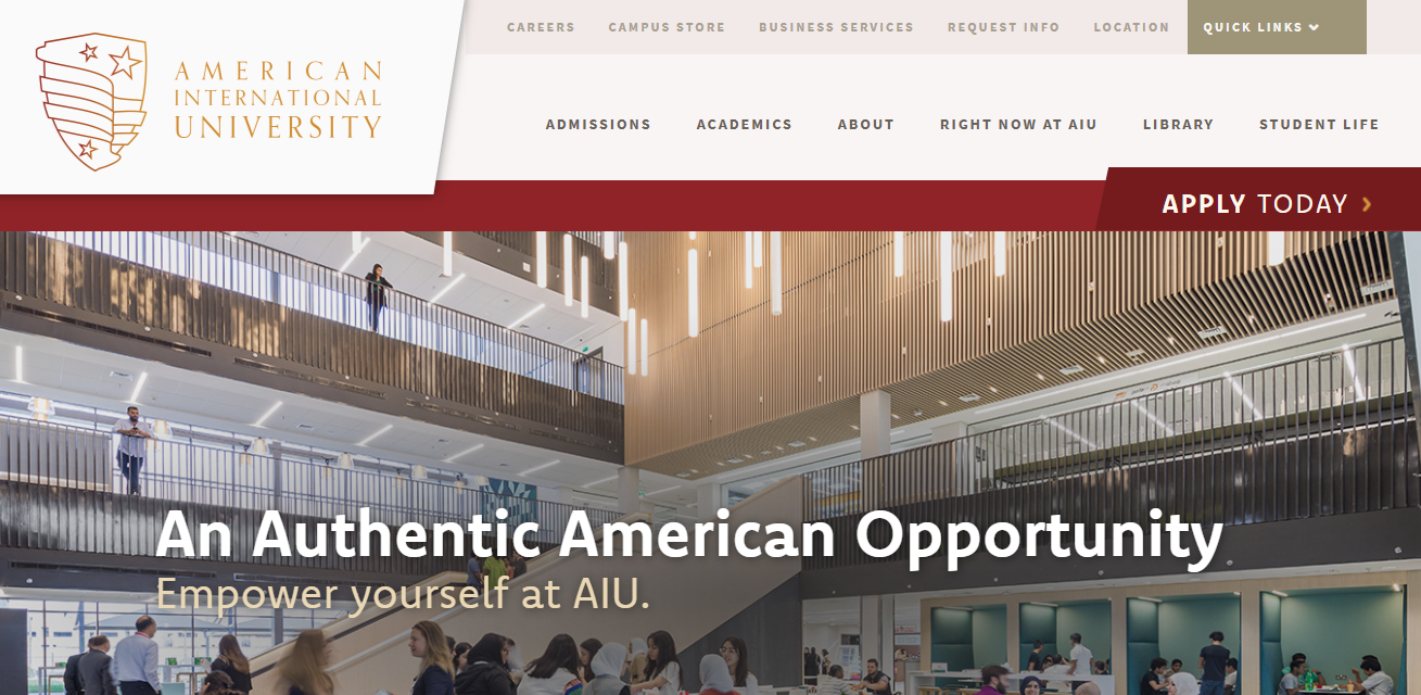
Also, take a look at how American International University provides a different type of navigation on their homepage. You’ll find that they’ve created a navigation system that allows website visitors to search according to the type of person they are.
You’ll see that there are tabs for prospective students who want to get more information about the programs they want to study, and there are also some tabs (like the careers tab) for people who possibly want to work at the university.
Offering an intuitive navigation like this is a very effective tactic that can help different users of the university’s website to easily access the information they need. It also encourages repeat website traffic for the university and can help to reduce their site’s bounce rate. This is a technique that you could also consider implementing for your site to improve user experience, although you should keep in mind that it will only really work for certain types of businesses.
Add copy that highlights the benefits of spending money with you
One of the common website design mistakes people make is not paying enough attention to the copy they publish on their homepage. However, you need to get it right, as homepage copy can either make or break a sale for your business.
When crafting your homepage copy, you want to take note of a few things. Above the fold, you should make sure that you’re highlighting the benefits you can offer customers. If your product or service is going to save people time or money, mention it. And let people know exactly why they should choose you over your competitors.
To highlight the relevant benefits, you’ll need to understand the pain points that your ideal customers are facing so you can come up with powerful words that will let them know how your product will help eradicate them. And one way to figure out customer pain points is by looking through the comments or questions that people send to your customer service team. Once you do this, you should be able to get some insight into some of the problems your target audience is facing, so it becomes easier to write copy that will speak directly to them.
You could also try to highlight the benefits of working with you by mentioning the past results you’ve been able to get for previous customers. For instance, if you were able to help a client get more clients or reduce their overhead business costs, it can be beneficial for you to include details like this in your homepage copy as it will help build trust and encourage potential customers to spend their money with you.
To truly see results from using this tactic, you’ll need to ensure you can write high-quality and helpful copy. Alternatively, you could outsource the task — for instance, at Loganix, we offer an SEO copywriting service that will take this big job off your plate so you can focus on other areas of running your business.
Summary
In this article, we’ve looked at some great tips that you can use to design a more effective homepage for your website. Some of the tricks we mentioned include using strong imagery, providing social proof, and also ensuring you write copy that highlights the benefits of people spending their money with you.
Make sure you get started on implementing these tactics if you want to boost the effectiveness of your current homepage. And, if you want any more tips on how to improve your website design, you can always follow Ltheme’s blog for more expert advice!
The post 5 tips that will help you design an effective homepage for your website appeared first on LTHEME.
![[Joomla] How to remove or hide Fields marked with an asterisk (*) are required](https://4.bp.blogspot.com/-O3EpVMWcoKw/WxY6-6I4--I/AAAAAAAAB2s/KzC0FqUQtkMdw7VzT6oOR_8vbZO6EJc-ACK4BGAYYCw/w680/nth.png)
![[Joomla] How to remove or hide Fields marked with an asterisk (*) are required](https://4.bp.blogspot.com/-O3EpVMWcoKw/WxY6-6I4--I/AAAAAAAAB2s/KzC0FqUQtkMdw7VzT6oOR_8vbZO6EJc-ACK4BGAYYCw/w100/nth.png)
0 Commentaires