Design is an important aspect of your website that greatly impacts SEO, because it affects the user experience of visitors. Essentially, if people don’t have a good time when they visit your site, they’ll leave immediately, which will hurt your SEO rankings because Google will assume that your site isn’t of a high quality.
So, in today’s article, we are going to look at the best practices in web development that can help improve your design so you can boost your site’s SEO.
Add engaging features to increase visitors’ dwell time
Dwell time refers to the amount of time a prospect spends on your webpage before leaving the site. Google pays attention to how long someone stays on your site after they’ve found it from a search engine result page — so if people keep leaving so soon, it will result in a high bounce rate, and cause Google to dock your rankings as a result.
This is why you need to create engaging elements and add them to your web pages to increase people’s dwell time and keep your bounce rate low. To do this, you can make use of attractive images or engaging video content to capture and hold your visitors’ attention. Or, you could even design interactive elements that will engage people so they spend longer on your website.
To give you some inspiration, let’s take a look at websites that have implemented this tactic well.

iCASH is a financial lending company that offers financial assistance to residents in different provinces of Canada. On their direct lenders web page, you’ll see an interactive tool that allows visitors to select how much they would like to borrow, the number of repayments they are able to make, and the province where they reside.
From looking at the tool, you can see how they introduce an engaging element to the otherwise mundane act of getting financial assistance. This does a great job of increasing the time that people spend on iCASH’s website and it can also positively impact their SEO because an increase in dwell time tells Google that visitors are having a great time.

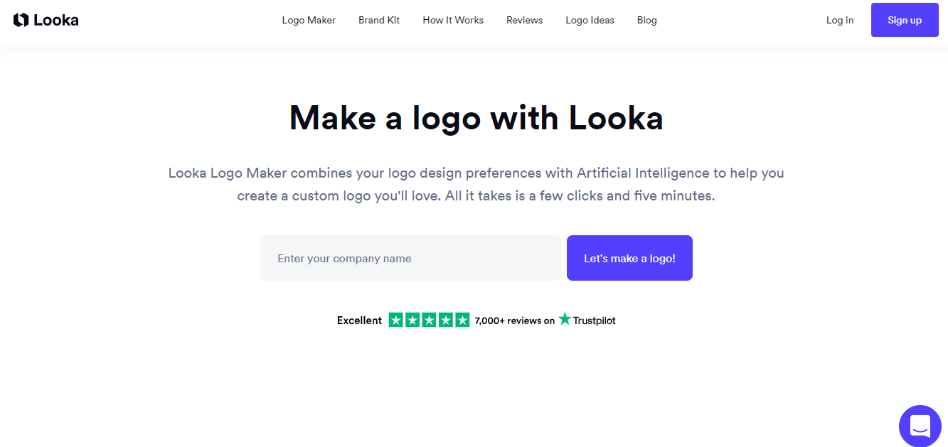
Looka is a company that specializes in helping companies to create their branding, and they’ve also added an interactive element to their logo maker page.
Specifically, they allow people to input relevant information like their company name, industry type, or brand colors, and then they use all this information to create a suitable logo for the user. One thing you can learn from this example is how they’ve personalized the buying experience for prospective customers to help prolong their dwell time. It’s a great tactic that can help them send a signal to search engines to show that people are enjoying their time on the site, and this could result in improved SEO rankings.

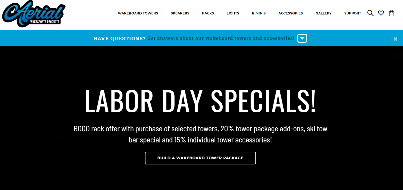
Last but not least, we also have this example from Aerial Wakeboarding, an e-commerce site that sells various wakeboarding products for water sports enthusiasts. If you look at their homepage, you’ll see that they’ve done a great job of creating several engaging videos that showcase some of the tower accessories they sell.
These videos play a part in increasing the time prospective customers spend on their site and reducing the website’s bounce rate, which is good for their SEO. You should also think about creating and adding engaging videos or interactive elements to your site if you want to increase dwell time and boost your rankings. And, if you’re having trouble with designing these elements, check out this guide from Ltheme on the various slider plugins you can use for your site.
Make your navigation SEO-friendly to help search engines crawl your site
In order for search engines to easily crawl your site, you’ll need to ensure that your website navigation is SEO-friendly.
This means applying best practices that will make your website easy to navigate. A general rule of thumb is to make sure you don’t have more than seven main items on your navigation menu. And, if your website has more pages than that, you should look into grouping the rest as sub-categories under the main pages. There are various menu plugins that allow you to do this so you don’t end up overcrowding your menu bar.
Also, you’ll want to use common words or phrases when naming the pages of your website. For instance, even though you might want to use phrases like “get in touch” for your contact page or “read me” for your blog page, it’s much easier and clearer for search engines if you use simple and common names on your site’s navigation menu, like “contact” and “blog”.
To give you a practical example, let’s study an example of a site with an SEO-friendly navigation.

Supply Smart is a company that provides products for residential plumbing, heating, ventilation, or air-conditioning (HVAC). Since they sell a variety of products, they’ve decided to use a navigation menu that allows people to search for items under different categories like plumbing, toilet repair, HVAC, or electrical.
Aside from the fact that this helps to simplify the buying process for their customers, this SEO-friendly navigation also makes it easier for search engines to crawl and understand their website and what they offer.
You could also consider using this tactic, especially if you sell a variety of products from different categories and want to make it easier for search engines to understand and index your website.
Creating space for social proof will help search engines trust you
One of the ranking factors that search engines like Google use is E-A-T. This is an acronym that stands for expertise, authority, and trustworthiness, and Google uses it to evaluate the quality of a website because the search engine only wants to promote sites that it trusts. This means you’ll need to add space for social proof on your website so you can show both people and search engines that they can trust you.
There are different ways to display the reviews you get from past customers. You could use review plugins to showcase star ratings and short testimonials for your product-based business. Or, make use of longer reviews if you have a service-based business, as those tend to work better because they allow people to provide more information about how much they enjoyed working with you. Some websites also display the qualifications and awards they’ve gotten, and this can be really helpful for companies in more professional or serious industries.
To give you some inspiration, let’s study how the following websites have chosen to effectively display social proof.

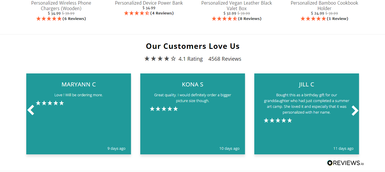
A Gift Personalized is a company that sells personalized and custom gift items. And, to build more trust with potential customers and search engines, they’ve created a section where they display several positive reviews from customers who have bought from the site.
These reviews do a great job of showing how trustworthy the site is because they highlight the positive experiences of various customers who have purchased different items from the store. And, in doing this, they make sure search engines will have no problem with recommending the company’s website to people who want to buy custom gifts.

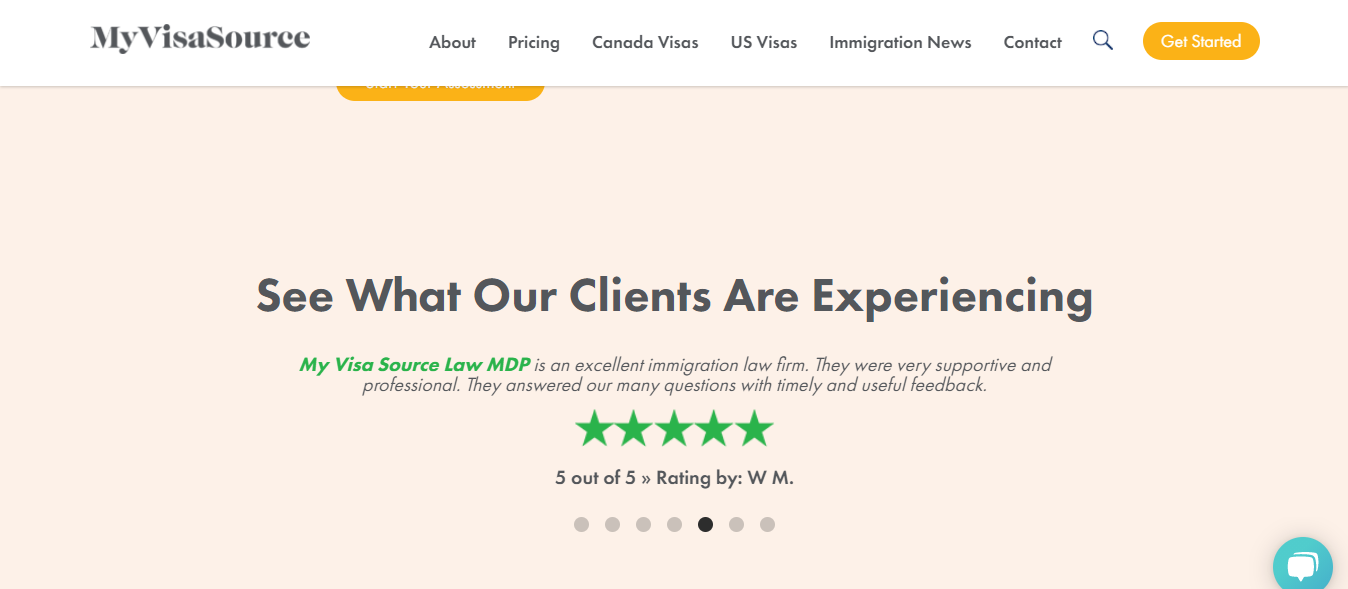
My Visa Source is an immigration law firm. They know that the process of immigrating can sometimes be quite tricky, and most prospective clients will want to work with a firm that knows what it’s doing.
So, to show how trustworthy and reliable they are, they’ve collated reviews from past clients and have displayed them for people and search engines to see on their site. If you scroll further down, you’ll also see the awards they’ve earned from reputable and relevant organizations in their industry.
These tactics work really well in helping search engines to decide that this is a safe and reliable site for users, which can help to boost their SEO rankings. If you aren’t already doing so, you should really look into displaying reviews from previous clients on your website, and you can use these examples as a guide.
Making your site responsive will improve the user experience
When designing your website, it’s important to ensure that it will look good on any device. This means you need to design your site for mobile, as well as desktop. If you can’t guarantee a positive experience for users of any device, search engines may decide not to rank your site well because they’ll be concerned that it will leave their users unhappy.
Moreover, Google introduced its Mobile-First Index in 2019, and this prioritizes the indexing and ranking of sites with a mobile version. So, it’s recommended that you use a responsive design that can make your website render well on any device.
One way to make your site responsive is by ensuring that you pay close attention to your typography. Remember that people are going to access your site from various devices, so try not to make your font size too little or too large so it can easily be read.
When making your site mobile responsive, you should also try to make sure that you design everything for people using their thumbs to tap their smartphones. This could mean moving certain elements to the middle of your web page because it’s typically harder for thumbs to reach the corners of phones. And, for smaller elements like calls-to-actions, it’s a good idea to make sure they have a height of at least 44px so they can be easily tapped by your users’ fingers.
Another thing to note when designing for mobile is the screen resolution of your website. You want to ensure that you design a site that transforms responsively when accessed via mobile. And, even though there is a wide range of screen resolutions, Toptal recommends keeping the most common screen dimensions for mobile in mind, which are 360 x 640 pixels for a small mobile phone, 375 x 667 pixels for an average mobile screen, and 720 x 1280 pixels for a large mobile.
To give you even more information, you can also check out this in-depth guide from BrowserStack on how to create a responsive website. Or you could choose to outsource the task to a professional website designer if you’re not confident about doing it yourself.
Use your own images (and optimize them)
Original photos are potentially better for SEO than stock images. In fact, Webmaster Trends Analyst at Google John Mueller explained in a tweet that, even though the search engine does not directly rank sites based on their use of original or stock images, it can be a bit harder for your images to rank well if the same photos can be found on other sites all over the Internet.
This means you should consider investing in your own photography or using original graphics designed with professional and quality tools. You should also make sure to optimize the imagery you’re using on your website, as it can be a powerful way to boost your SEO.
For instance, when adding the alternative text for your images, ensure that you save them with text that describes the exact image being used instead of using generic names (like image 01). Doing this is important for SEO, as it helps your website to appear in Google Images or on web search results for relevant queries.
You also want to optimize your images by making sure you save them in the right format. The most common ones are JPEG, PNG, and GIF, but most design experts recommend using either JPEG or PNG as the best file formats so you can retain the quality. It’s also worth noting that image editing and optimization isn’t always the easiest thing to do, so you’ll want to look out for image extension tools to help you with this.
Another thing is that you need to make sure you name your image files appropriately and with relevant keywords. This is very important for SEO because not only do search engines crawl through your website copy, but they also crawl through your image file names. So, you’ll want to use descriptive and keyword-rich names for your image files when saving them.
Lastly, you also want to consider the file size of your images when uploading them to your website. If your image file sizes are too large, they could slow down your website and reduce your page speed. And, if your website starts to take too long to load, visitors will most likely leave, which will hurt your SEO rankings. A good rule of thumb is to keep your image file size under 70 kb but, if you have files that are larger than that, you can always compress them using tools like Img2Go or TinyPNG.
Summary
Your website design plays a very important role in your SEO, so it’s really important that you get it right. Fortunately, we’ve looked through five different tips that can help you get started, and it’ll do you well to start implementing them.
And, if you want to keep learning about tips and tricks for improving your site’s design and your overall business, make sure you follow the Ltheme blog.
The post 5 ways you can tweak your website’s design to boost your SEO appeared first on LTHEME.
![[Joomla] How to remove or hide Fields marked with an asterisk (*) are required](https://4.bp.blogspot.com/-O3EpVMWcoKw/WxY6-6I4--I/AAAAAAAAB2s/KzC0FqUQtkMdw7VzT6oOR_8vbZO6EJc-ACK4BGAYYCw/w680/nth.png)
![[Joomla] How to remove or hide Fields marked with an asterisk (*) are required](https://4.bp.blogspot.com/-O3EpVMWcoKw/WxY6-6I4--I/AAAAAAAAB2s/KzC0FqUQtkMdw7VzT6oOR_8vbZO6EJc-ACK4BGAYYCw/w100/nth.png)
0 Commentaires